
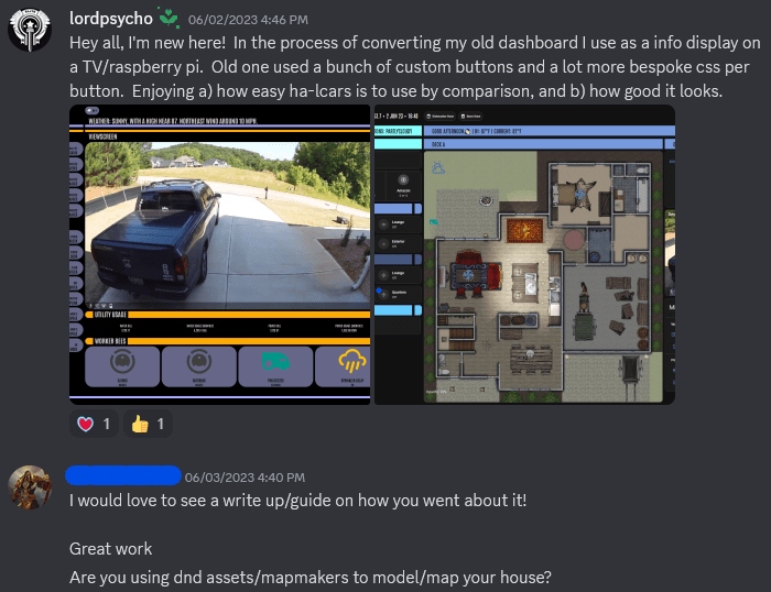
Happy Saturday, all! So – you may have noticed this isn’t going to be my normal fair. If you are new here, welcome! This is my blog where I (mostly) discuss Jira and Atlassian tools! But as I noted, today is an Extracurricular, meaning I’ll be writing about something other than Atlassian! This was actually requested after shared some changes I’ve recently made to one of my Home Assistant dashboards:
Well, lucky enough doing write-ups and guides is one of the things I do! So let’s dig into this!
Pre-Reqs
So, to create this layout, I first needed to install HACS and get a few additions to my system. Namely:
- layout-card
- card-mod
- Mushroom cards
- ha-lcars
Now, there are plenty of guides already out there for installing HACS, so I won’t go into detail on how to do that part.
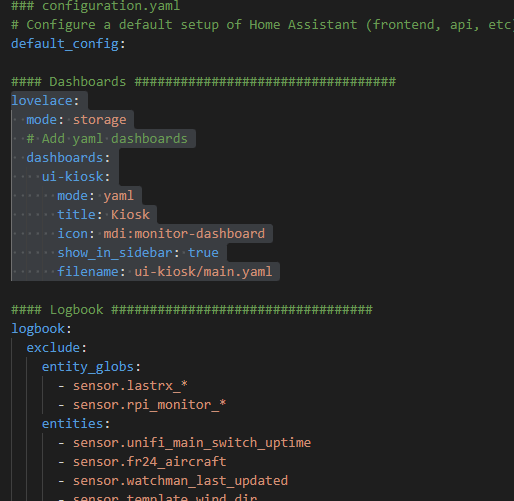
Once you have the mods installed, let’s set up your dashboard. I like to reuse code using “!include” whenever possible, so we’ll be making a YAML file based one. These have to be defined in your configuration.yaml file by adding the following code block.
lovelace:
  mode: storage
  # Add yaml dashboards
  dashboards:
    ui-kiosk:
      mode: yaml
      title: Kiosk
      icon: mdi:monitor-dashboard
      show_in_sidebar: true
      filename: ui-kiosk/main.yaml
Some explanations:
- lovelace: This defines the main section of your config, letting HA know you are talking about dashboards.
- mode: storage: This lets HA know you intend to use the backend storage for most dashboards. You can, however, still define extra dashboards in this file, which is what we’ll do
- dashboards: This is where you will list your additional dashboards
- ui-kiosk: This is the dashboard I defined for this case. You can ideally name it whatever you want, but be aware that it has to contain a hyphen (-). As such, I usually name my dashboards “ui-” then some sort of identifying name, kiosk in this case
- mode: yaml: Tells HA that this dashboard uses yaml instead of the default storage
- Title: self-explanitory
- icon: also self-explanitory
- show_in_sidebar: This boolean lets HA know if you want this in the sidebar
- filename: where to find the main config file for the dashboard. I usually like to put dashboards into a folder with the same name.
All together in the configuration.yaml file, it should look like this (and do note the dots, indicating spaces):
Dashboard folder structure:
Now – I’m a stickler for repo organization, so I usually like to have my dashboard folder organized as such:
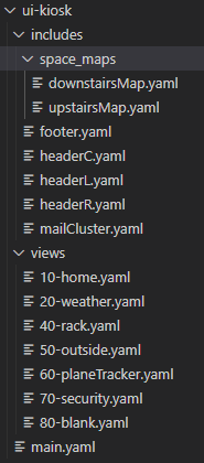
A brief Rundown:
includes
This contains cards that I like to reuse between views. Doing this allows me to only have to edit the card in one place, and the change shows up on all pages. You can include additional folders here to further organize includes, such as what I did with the map files
views
These will be the individual pages of the dashboard. While I show my age with the numbering of the files, this is not necessary, and has zero impact on the ordering of dashboard views. That is controlled by how we include the views in the main.yaml file
main.yaml
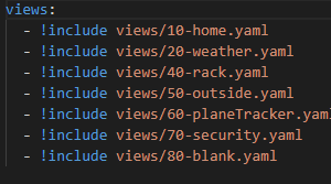
This is the most boring file, whose only purpose is to tell HA what views are included into the dashboard. This file will be what is referred to in the configuration.yaml file. I’ve shows the entire file above.
Setting up the view
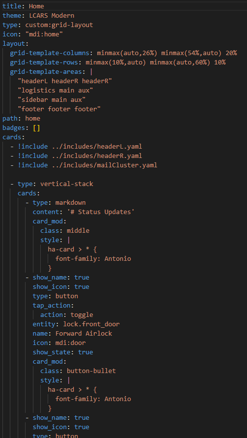
So, let’s set up the view. We’ll start with the “header section” that defines the dashboard view as well as sets up the layout.
- title: what to call this view
- theme: Use one of the ha-lcars theme. In this case I’m using LCARS Modern
- type: set this to custom:grid-layout
- icon: appropriate mdi-icon:
- path: the end URL for this board. in this case it will be ui-kiosk/home
- layout: This is where the magic starts. This tells your browser not only how to set up the board, but also what sections are defined for the cards. I’ll show you how to tell which card where it will go – but as always, I highly encourage you to abuse the vertical-stack and horizontal-stack cards.
- grid-template-columns: this defines how many columns you will have, and how they will be spaced out on the board. In this case, I define 3 columns. The first I say “it can be small if possible, but should max out at 26%. Likewise, I tell the second column it should be no smaller than 54% (matching up with the max of the first), but can be bigger. The third column is hard set to 20%.
- grid-template-rows: Same thing, except I’m defining the rows.
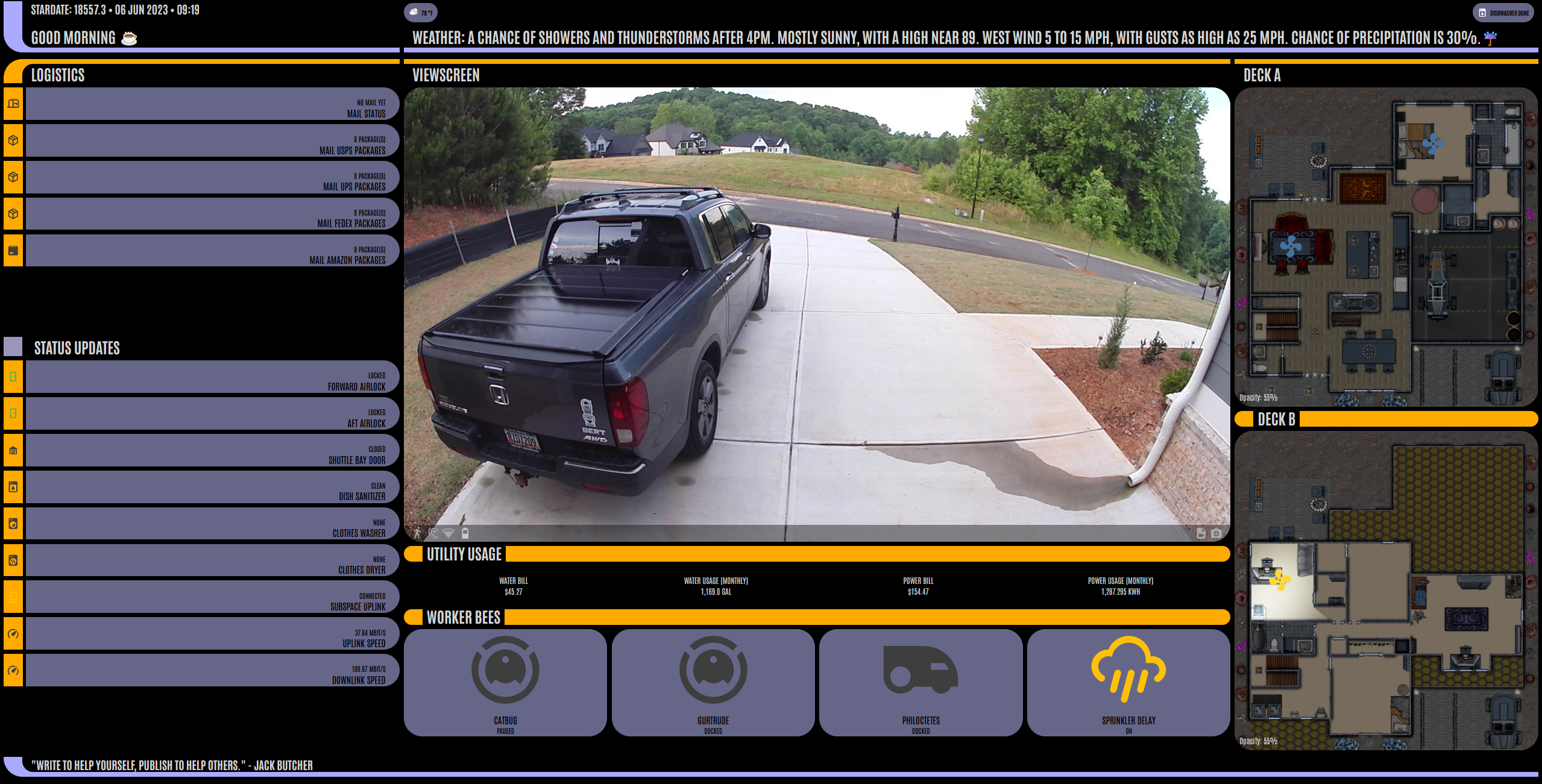
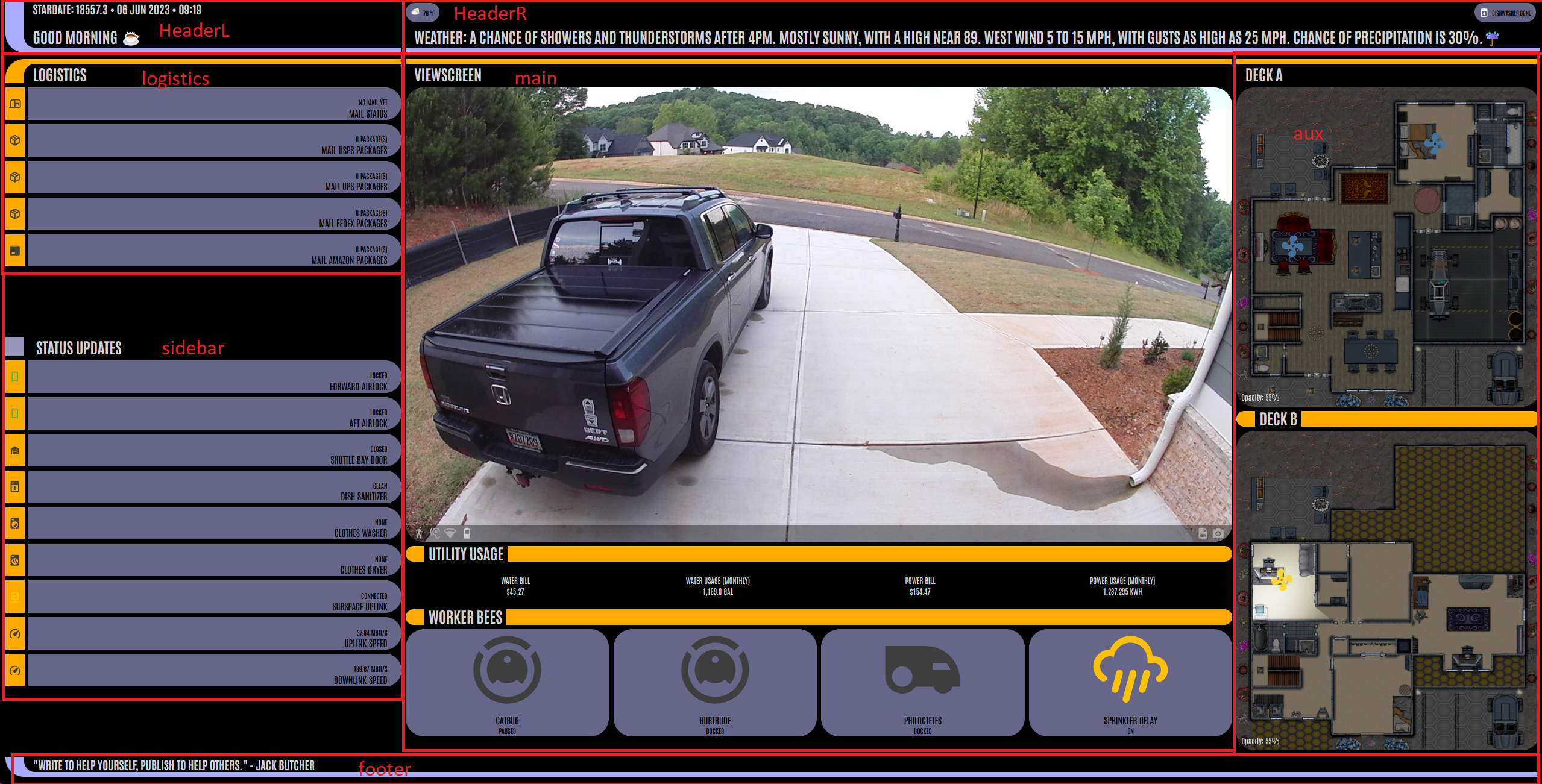
- grid-templates-areas: This is where I define the various areas or sections cards can occupy. Note: an area can occupy more than one section by repeating it’s name – such as I’ve done with ‘headerR’ or ‘main’. This stretching can be done either vertically or horizontally, as shown. I’ve included a view below that includes how each section on the final dashboard maps to the grid-template-areas – just use the slider to see the dashboard with and without the labels.
Cards:
type: vertical-stack
view_layout:
  grid-area: headerL
  place-self: end stretch
cards:
  - type: markdown
    content: >-
      ## Stardate: {{ states('sensor.stardate')}} • {{ as_timestamp(now())
      | timestamp_custom( '%d %b %Y • %H:%M' ) }}

      #  {{ states('sensor.template_header_greet') }}
    card_mod:
      class: footer
      style:
        .: |
          ha-card > * {
            font-family: Antonio;
          }
        ha-markdown:
          $: |
            * {
              white-space: nowrap;
              overflow: hidden;
              text-overflow: ellipsis;
              overflow-wrap: unset;
            }
So, now that we have the view, we need to add cards. Now for the reusable include cards, you can simply do a “!include” and then point to the file name – same as we did for the views. I’ve included the code above for the includes/headerL.yaml. Note the “view_layout” section. This should be on the same level as your “type” declaration, and is required to have the “grid-area” defined. This should match up to one of your grid-area-template sections. The second option, “place-self,” is optional, but immensely helpful in making things line up. Trust me, I spent a week trying to get the header sections to line up before figuring out I needed place-self.
Now, the order you put different cards really does not matter, so long as every top-level card has a view-layout on it – the card will fall into it’s appropriate section.
Includes between Dashboards
Now, only one other thing I want to discuss. There are certain cards I want to share between dashboards. Those I have placed in ui-includes folder on my github. Principle among these is my alert chips – which is a bunch of conditional chips that let me know what appliances have finished their run, various conditions, and more. For these, I use the custom:mushroom-chips-card, but I did want to share where to find those.
Github
So I’ve set up a github for my home-assistant config, including the ui-kiosk dashboard I’m in the process of converting. You can use that as a reference and see how I set up different cards:
What do you think?
I know some of my normal readers are also playing around with Home Assistant. What projects are you in the middle off? I’d love to hear about it! I’m always looking for new ideas.
If you enjoyed this piece, consider following me on social media! I post weekly tips, tricks and how-to’s so you can get the most out of your Atlassian tools, but obviously that’s not the only thing I’m doing! You can find my links on https://linktr.ee/thejiraguy
But until next time, my name is Rodney, wondering, “Why the heck is that thing doing that now!?”
 The Jira Guy
Nice! Thanks for the coverage 😎
LikeLike
The layout and custimization is cool. However it appears you also incorporate swipe cards and possibly others that are called but not referenced in the write-up.
LikeLike