
Paid Partnership with Old Street Solutions (A Tempo Company)
It’s time.
Long-time fans will remember that I reviewed Custom Charts for Jira waaaaay back in July 2020. At that time, I wrote this:
“Honestly, I was hoping for more charts. In a world with seemingly a million ways to display data, the seven given feels a bit limiting. I see the line chart on their Roadmap, though, so I’m not the only one who missed it. Maybe this is something they intend to grow as they have time. But honestly, that’s about it. It’s a robust offering that you can tell was built with intent and care!”
I gave it an “A” Rank on my tier chart in that review. Don’t get me wrong, it’s still very good, but the Tier chart is both very subjective and a very silly way to rank marketplace Apps. That said, if any of you know Chris, you know he would not take that slight sitting down. He promised that he’d a) get me to re-review Custom Charts, and b) upon that re-review, I’d be forced to give it an S-Tier. And to his word, I don’t think we’ve had a conversation where it hasn’t been brought up.
However, becoming an “S” Tier app is a high bar. I generally reserve those for Apps that make me rethink how I approach Jira. Take Automation for Jira. Before it came along, the best we had for bespoke Automation was Scriptrunner, which is good in its own right but is something I would only trust to a Jira Admin. This fact meant, unfortunately, I ended up being both a gatekeeper and a bottleneck for Jira Automation — not a role I enjoy. Automation for Jira changed that. It was simple and safe enough that I could trust Project Admins with it but powerful enough to let them do what they wanted.
So, Chris, does Custom Charts reach that bar? Let’s find out!
Features
Let’s face it, Jira’s built-in dashboard gadgets are…well…disappointing. It only gives you so many ways to parse your data. Considering how granular you can get with JQL, it’s surprising how few times Atlassian has given us new gadgets. That’s the problem that Custom Charts attempts to solve.
The Charts
Simply put, Custom Charts for Jira gives you more ways to divide, sort, organize, and display your data. How many more? Well, here are the ten chart type it adds.
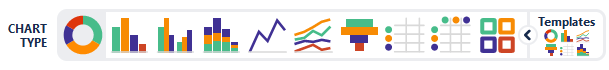
- Pie Chart
- 1D Bar Chart
- 2D Grouped Bar Chart
- 2D Stacked Bar Chart
- 1D Line Chart (New)
- 2D Line Chart (New)
- Funnel Chart
- 1D Table
- 2D Table
- Tile Chart (New)

I’ll also note that we have three new charts since my last review. One thing I noted in person with Chris talking about my last review was how surprised I was that a simple line chart wasn’t already included…which was one of the first things he had added to the App.
Intuitive Design
One thing I’ve always admired about Custom Charts is how easy it is to set up. Don’t get me wrong, I’ve never found Dashboards in Jira difficult, but it is a bit tedious going to add a gadget, realizing you don’t have a saved filter for what you want yet, going to the issue search, building your query – a process that can take a few minutes to get it dialed in *just right*, forgetting to save it, going back to your Dashboard, realizing what you forgot, recreating the filter, making sure you save it this time, going back to your Dashboard, then configuring your gadget.
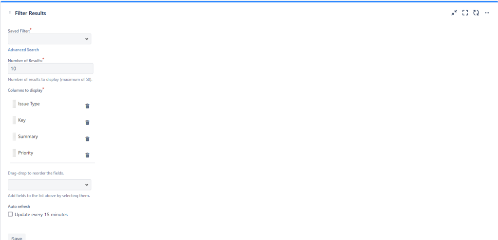
Instead, everything is done right in the gadget. First, select your source, then what field you are charting by, and start working on your format. It has always been a very intuitive interface, for which I gave bonus points in my previous review. As stated, “Anything I can give users where they can just figure it out without hand-holding gets a win in my book.”

One thing to note is that you can disable or enable different items from your chart within the gadget. This feature lets you dial into important information with a single button click. Some of the data on my sample project is messy, but I could still get some usable data from Custom Charts.
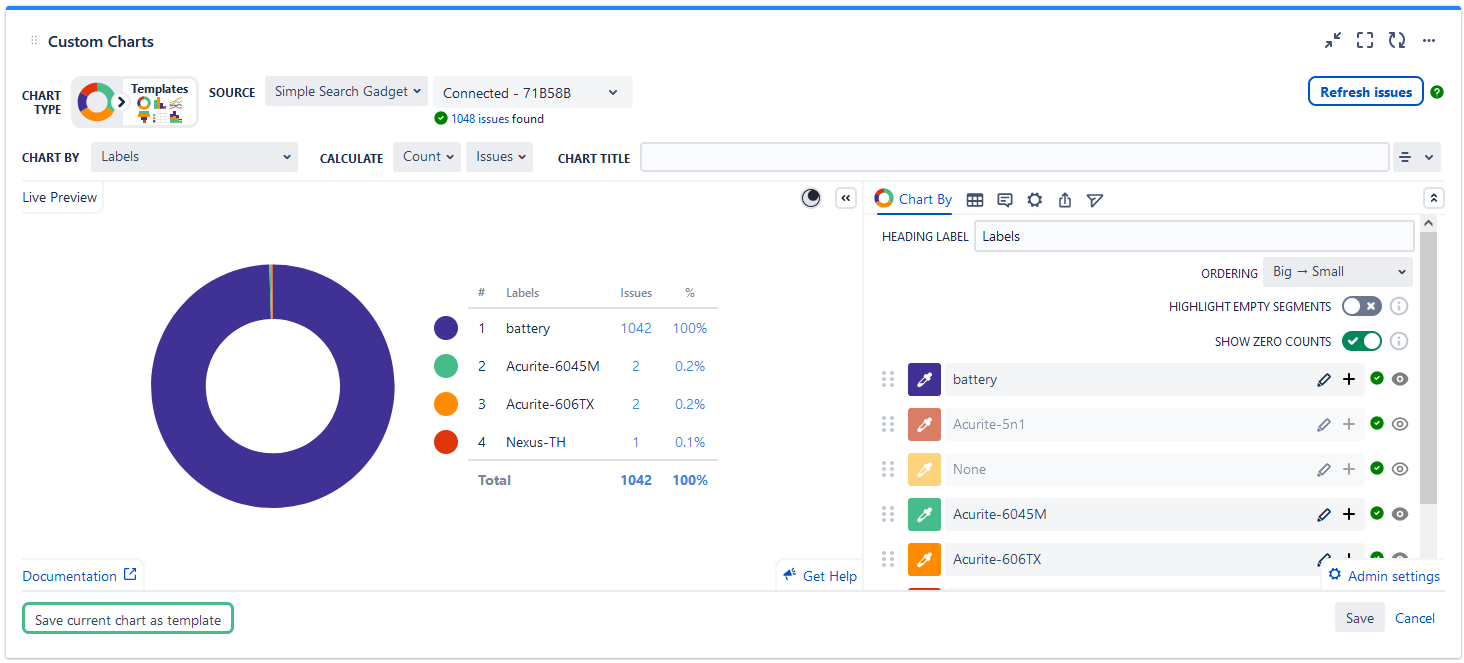
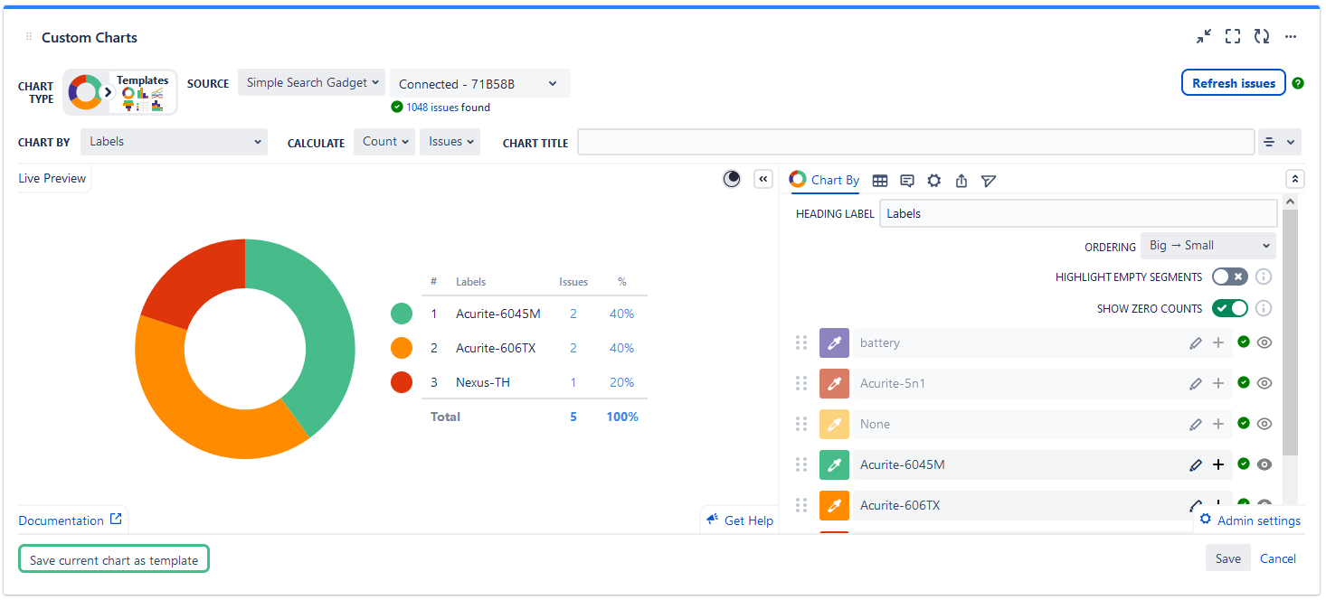
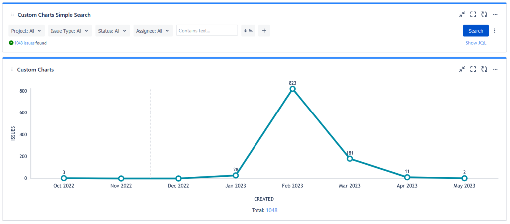
Simple Search Gadget
Another standout feature is the simple search gadget. When you add this to your Dashboard and use it as the source for your other Custom Chart gadgets, all your charts become dynamic objects. That is, you can use the gadget to specify what data segment is being displayed. Do you want to see issues created in the past week? Do it! How about seeing all tasks assigned to Clippy? It can manage that. Only care about bugs created between 18-Apr and 21-Apr by Rebecca and mentions “Dice”? That’s oddly specific, but have at it.
Don’t get me wrong – Custom Charts isn’t the only App that does this sort of “Dynamic Dashboard” gadget, but the fact that it integrates so seamlessly with its charts is something to uphold. In speaking of Integrations…
3rd Party App Integrations
I’m assuming this is a new feature – as I neither recall seeing it last time I reviewed this App nor did I mention it. However, this is a big improvement.
If you have used Jira for any amount of time, you likely have some data stored in third-party Apps. So, how do you parse and display data from these Apps? Well…Custom Charts, of course? Why would I be bringing it up otherwise? Old Street has ensured that Custom Charts is compatible with several Addons, including Xray Test Case Management, Jira Workflow Toolbox, Profields, Elements Connect, and much more. You can find the list at the bottom of this page.
I cannot express how happy I am to see this. In most cases, data in third party Apps are siloed, only allowed to play in their own little playground. Custom Charts have opted instead to let them all out to play together – which can only give you a clearer insight. Definite thumbs up!
My Analysis
What this App does well
When I last reviewed this, I stated this App does only one thing, but it does it very well. That has not changed. Over the past three years, Old Street has continued to improve and refine the user experience within the App.
One thing that struck me in this review was how consistent the experience was. The last time I reviewed it, I was on Jira Server. This review was done on Jira Cloud. However, comparing my screenshots from the last review to this one, the user experience is very similar across both – not 100% the same, but not so different I feel like I’m learning a new App altogether.
All and all, I think you’d be very fortunate to have this App in your Jira Toolkit.
What this App could work on
Alright, confession time. Last time, I stated I’d love to see more charts. Truth be told, I was grasping at straws. STRAWS. This App does what it does so well that I couldn’t think of much I’d improve on it.
And Old Street goes and takes even that way from me. Well played, but not checkmate.
I could say, “More Integrations, Plz,” but I’m sure they are already working on that.

No, I’m The Jira Guy, and every App can improve. However, for Custom Charts – my biggest annoyance was this pop-up that appeared EVERY TIME I added a gadget. I get a pop-up once (or twice if I forget to press some button), but I couldn’t find anything saying, “Don’t pop this up for me again.” It’s a minor quibble, don’t get me wrong, and not worth missing out on the App, but it’s something.
Would I recommend this App?
Absolutely! Every Jira instance should have access to Custom Charts. It so fundamentally improves Dashboarding that I’m surprised it took a third-party App to do this.
And yes, this also still applies:
Just be warned, once your users have a taste of what this App can do for their dashboards, they may never return to only using the default settings again!
User Map’s Tier Rank
So…Chris. This section is what it all comes down to. As a reminder, What separates an “A” Tier from an “S” Tier app is this question: Does it fundamentally change how I approach a particular task in Jira?
Automation for Jira changed how I approached it, allowing me to open it up to more people.
Appfire’s Power Admin changed how I run Audits, allowing me to get information on Custom Field usage (among other things) much more quickly.
Extender for Jira changed how I worked in post functions and autogenerated Documentation on said workflows.
Does Custom Charts reach the same level?
How long can I keep the answer from Old Street?
How long can I make this blog post?
Are there any more questions to be asked?
Honestly, I want to give Custom Charts an “A” tier to see Chris’s reaction, but thinking back over the past three years, I can’t do that. I’ve always celebrated when I see a Jira instance I’m working on has it. It means that I and my users will have a massively improved Dashboarding experience. And if that doesn’t qualify for the “S” Tier, I don’t know what does. Congratulations, Chris. You made me do it.

So, what do you think?
Are you using Custom Charts? How do you like it? Let me know! I love reading your feedback. Plus I’m wondering how many jabs I’m going to get for “selling out.”
As always, you can find my social media links on my Linktree. Be sure to follow, like, comment, and share the content – it really does help.
Also few notes:
If you are local to Atlanta, please don’t miss the Atlassian Team 23 recap with the Atlanta ACE on May 11th, starting at 6:00 PM EDT. Community Leader Ed Gaille will be providing BBQ, and I’ll be speaking with fellow Certified Expert Sharon Connell. I think there might be Zoom links to catch this remotely.*
*Remote viewing does not include BBQ.
Likewise, you can catch me, Brittany Joiner, and Nishant Sasi
as we copanel a Team 23 Recap for the Dehli/Gurugram ACE Chapters in a virtual event on May 12, 2023, 6:30 – 7:30 PM IST.
I’ve got a lot of plans coming up over the next few months, definitely an exciting time in the community. But until next time, my name is Rodney, asking, “Have you updated your Jira issues today?”

Thanks Rodney, great review. We’re adding an option so people can remove the popup wizard (Don’t show me this again).
Also look out for our next features dropping soon: Time in status, issue history, time tracking, a Tempo timesheets integration, and the ability to publicly share dashboards anywhere!
LikeLike
Nice! But I’m missing Exply (https://marketplace.atlassian.com/apps/1216773/exply-dashboards-charts-reports-for-tempo-csv-sql?tab=overview&hosting=cloud) in your tier list 🙂 Would love a review too!
LikeLike
Hey Rodney, you missed a feature they added that definitely brings it up to an even greater level
They added the ‘issue list’ gadget, which was nice before, but then they updated it to be able to have additional filters. This was a game changer.
I’ve set up dashboards that have the core simple search looking at (for example) just a single project, then linking up several issue list gadgets to that simple search and providing them with additional secondary filters.
So for example I have issue list 1 set up to show ‘task type 1’, issue list 2 set to show ‘task type 2’, issue list 3 set to all other tasks with some optional additional filters for drilling down further.
And when you filter with the simple search gadget, all the issue lists update just like the graphs! So if I want to see all the issues created within a certain date, I have them all filtered in the various issue list gadgets. 12/10 feature they added. Definitely recommend.
LikeLike