
So, I’ve been on many Jira instances over the years, and I’ve noticed a pattern with most of them that is a common theme.
Project Managers or Project Leads find out Jira will let you add as many fields as you want, and they go crazy and start requesting every Field under the sun for their Project. The truth is, they may have good reason to do so. For example, they may be hoping to capture better information on which issues should take priority or use information captured during the work on an issue to know how their Team is performing.
However, this is where a good Jira Admin steps in. As with all good things, fields are good when used in moderation. Your primary concern as an Admin should be the welfare of the instance, and having too many fields in your instance will slow your instance down. Trust me; I’ve seen it – multiple times.
But, the concern does not end there. Given how Jira is set up, one of the many hats you need to wear as a Jira Admin is a UX/UI Engineer. It is often up to you to design the screens that users see every day in their instance – and how you design it will directly impact their experience within your instance and can often shape how they see Jira entirely. All too often, a User writes off Jira completely because they were on just one instance that was maintained and designed poorly.
So today, we’ll look at how best to design screens – keeping the end-user in mind – and some tricks to make them more usable for everyone.
So how many Jira fields is too many?
Well, I know some of you are going to hate me for this, but the answer here is, “It depends.” I know, very lawyerly of me. But no – it does. The number of Fields you should have on a Pop-up is significantly less than the number you can get away with on Issue Creation and Editing. It will also depend on how many of them are required Fields – because you know, this topic isn’t complicated enough.
What does Atlassian say?
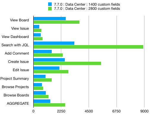
Unfortunately, Atlassian’s answer here takes a view as the instance as a whole and forgets that actual people use the product. And while that does play a part, it doesn’t help us in our discussion today. However, the article in question is worth reading and has one of my favorite graphs from Atlassian.
To further complicate matters, the UI/UX Experts online can’t seem to agree either. Some say between 10-11 fields; others say between 3-5. I suspect that because this isn’t my main area of study, there are aspects that are lost to me here, but if there is, they haven’t explained it either. So what I’ll present here today is based on my own experience and what I’ve found to work best.
What I recommend
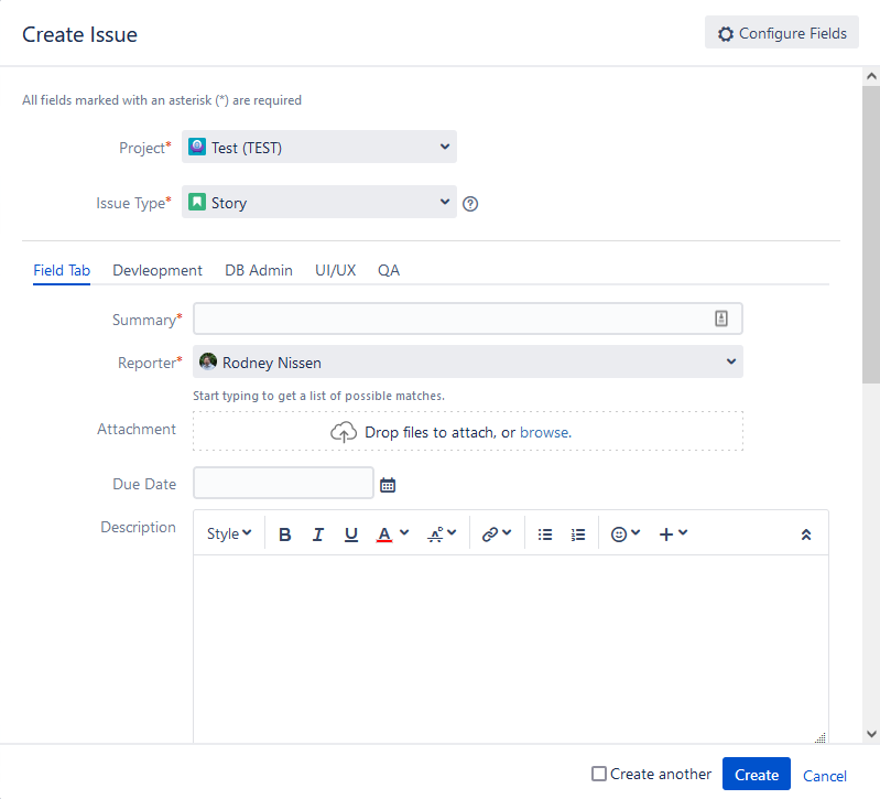
So let’s start with Issue Creation and Editing. These screens will be how your users see your design most often, so you must get this right. I’ll have additional advice on designing your screens below, but I like to keep the default tab on the Create and Edit screens to under 10 Fields as a general rule of thumb. However, this includes the system-required fields of Issue Type and Summary – so really, you only have 8 to work with.
The Problem with Pop-ups
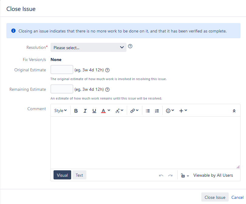
As for Pop-ups, these are a bit different. Imagine you are a worker. It’s the end of your day, and you had a good productive day. Before you clock out for the day, though, you decide to close out the Story you just finished. So you slide the issue over on the board – and BAM. You are hit with a wall asking for 15 pieces of information, all required before you can close the issue. What would you do?

I don’t know about you, but I’d close my browser, clock out, and call it a day. That’s tomorrow’s problem. However, doing so distorts the data. That issue was actually completed today, but saving it for tomorrow makes it look like it took longer than it did, making your Team look like they are performing worse. I mean, as a worker, that wouldn’t change my mind, but it is the result of the action.
This situation is why I feel pop-ups screens should have fewer fields than regular screens. They are – by design – an interruption. So, you want that interruption to be as minimal as possible. So I try to limit my screens to having no more than three fields. However – a hiccup there. Any Transition screen includes the comment field automatically. And yes, I include that as a field. Just because you can’t control it doesn’t mean a User won’t see it that way. So, in reality, the amount of fields you should include on a pop-up screen is 2. Yes, that is very limiting. But that’s the whole point.
Best Practices for Screen Design
So, we have our limits. So, how do we go about designing screens so that they are easier to use? Well, there are some tricks here, so let’s dig into it.
Use the tabs, Luke.
Some of you Jira Admins might have caught this in the previous section. But for those that didn’t, a recap.
…I like to keep the default tab on the Create and Edit screens to under 10 Fields.
Me, literally just above
Catch that now? Yes – I was only talking about the first Tab. Tabs are a great way to organize fields on a screen to make the form seem friendlier. But how do you organize it? There has to be some orderly categorization for the Tabs, or no one will ever be able to find the Field they need.
Here’s one of the best examples I think I’ve implemented. We had several teams with their projects. An issue would move from One Team to the next, and therefore one Project to the next, over its life. First Project Management, then Development, SQL, UI/UX, QA, and finally back to Project Management for inclusion into the final release. However, each Team had its own set of fields that were needed for their work. Given how things were set up, they needed to fill out fields before receiving the workpiece, but they wouldn’t even be able to see that Field until it got to them.
So how do we fix this situation? Well, we set up a new screen scheme that was to be shared by all the projects. This way, an issue would look the same no matter where it was in the lifecycle. We then created Tabs for each Team and put Fields that only that Team would care about their Tab. If Field is used by more than one Team, it would go in General – keeping in mind the above limit.
In this example, we used the Teams as the categorization method for the Tabs. But there are others. For example, suppose fields will only be used in particular statuses over an issue’s lifecycle. In that case, you can name the Tabs after the relevant statuses and put their fields in there. The only actual limit here is your understanding of how users work and your imagination.
Don’t make users hunt down Required Fields.
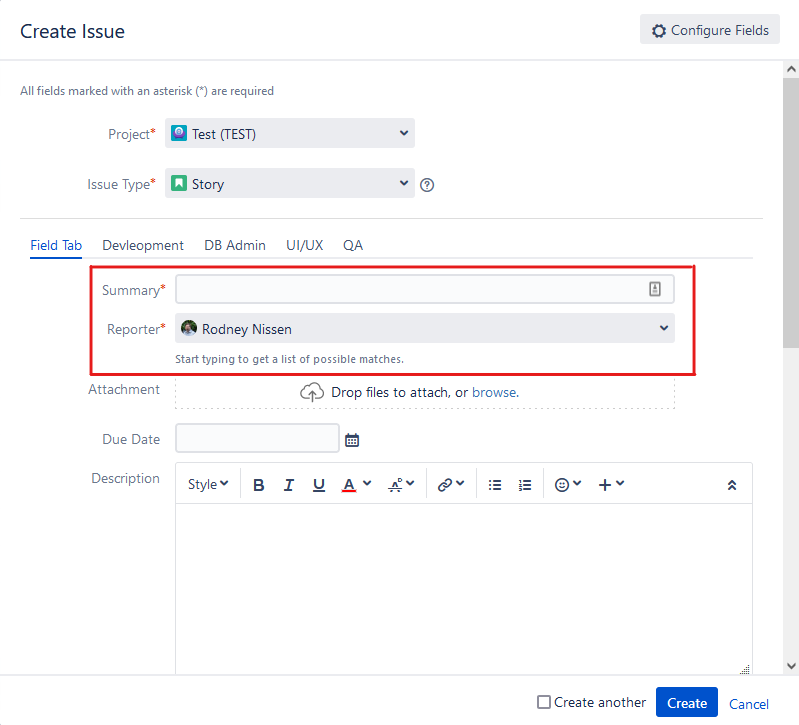
Another rule of thumb I use when designing screens is to make sure the user knows which fields are required at any given time. It’s inefficient to have a user hunt through tabs to find that one Field preventing them from creating an issue. For this reason, I put all required fields on the very top of the first Tab.
I’m also very strict on how many required fields are needed at any given time. Unfortunately, I’ve met Project Leads who are convinced that every Field should be required every time – and get angry enough when you disagree with them to nearly come to blows. Thankfully, they were the exception and not the rule.
The three questions I ask whenever someone asks me to make a Field required are:
- What information are you trying to capture?
- How do you intend to use and report on this information?
- What happens if you don’t have this data?
I’ll also caution Leads about the danger of having too many Required Fields. I mean, who here hasn’t entered junk data to get Issues created? I’m a Jira Admin, and I’ve done it. The chances of this happening go up dramatically with each Required Field you add. And what’s worse, No Data or Bad Data?
Automate Fields where possible
This should go without saying, but anything your users don’t have to fill out is something you only need to put on the view screen – not edit or create. There are many ways to automate a field, but one of my favorites is to set the resolution based on which transition the issue takes.
I’ve also set up a scripted field that will update depending on what people enter for other fields or issues. I’ve done fields that use Automation for Jira or Scriptrunner to create a score for an issue based on its severity and priority. The only limit here is your imagination!
Don’t need a field right away? Pop it up when an issue transitions into a relevant status!
This is another trick to keep the field count down on the create screen. With every issue, there is information you will need to record at some point over the lifetime of the issue, but you won’t know at its start. So then why should it take up screen real estate on the creation screen? Instead, create a screen that can pop up later on the issue. We, of course, need to keep in mind our limits and make sure not to overload the user in the pop-up, but keeping fields timely to when it’s needed is one way to keep your instance looking cleaner and easier to use.
So, what do you think?
What are some of your favorite tips and tricks when designing screens? Do you have any rules of thumb you follow? Let me hear about it in the comments!
If you have an idea of something you would like me to write about, please let me know! You can use the contact link above to tell me what you want to hear about!
Don’t forget to check out The Jira Guy on social media! You can find all our links on Linktree. If you want to help people discover the Blog, be sure to like, comment, and share on the platform of your choice.
You can also find links to support the work we do here directly. Any money given is put directly back into making the Blog better, so all contributions are appreciated.
And lastly, if you like what we do, don’t forget to subscribe. Doing so tells the Blog where to email you a copy every time I push publish on a new post. It’s the fastest way to get updates!
But until next time, my name is Rodney, asking, “Have you updated your Jira issues today?”

Hi, What’s with the ‘Automate Fields where possible’ – can you provide some cool examples to light it up?
LikeLike
I do have a great example, but unfortunately, it will have to wait until later tonight, as I’m on the clock right now.
LikeLike
Seriously, are you moo? I ask myself this every day, and I never have the same answer.
🐄
Love the article, and you’ve reminded me to look at my transition screens…
LikeLike